You've Already Lived Through It
Jon Green • Published on Jul 30, 2026
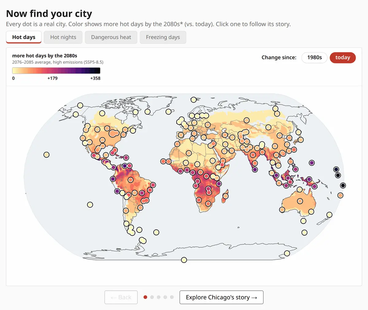
Climate change is usually told in degrees of global average warming — precise, and almost impossible to feel. This tells it in a unit everyone already owns: days in a year.
Pick one of 166 cities and follow its story. Miami went from 38 hot days a year in the 1980s to 91 today — measured, not projected. Chicago is committed to roughly doubling its hot days again by 2045 whatever happens next. And by the 2080s Chicago’s two possible futures stand 31 days apart, which is the part still open to us.
The chart is the argument
The middle scenes use a waffle year: 365 cells, arranged in seven-day bands so the grid carries its own ruler. The denominator never grows, so watching the colored days advance while the ordinary ones give way is the argument, not just the data. Chicago’s 91 hot days aren’t “about a quarter of the year” — they’re thirteen countable weeks.
That choice is deliberate rather than decorative. The map encodes magnitude as shading, which is the weakest of Cleveland and McGill’s elementary perceptual tasks, so it’s used only to locate a city and read the broad pattern — which is itself the argument for drilling down. The closing line chart sits at the opposite end, encoding position along a common scale, which is why it carries the synthesis.
Measured and modelled, kept apart
The distinction I was most careful about. History from 1980 to 2024 is measured, from the Open-Meteo Historical Archive. The 2040s and 2080s are modelled, from the World Bank Climate Change Knowledge Portal (CMIP6, median ensemble), across a moderate and a high emissions pathway.
Projections are delta-method bias-corrected against the model’s own recent baseline, so what’s plotted is the model’s change applied to observed history rather than its absolute output. Without that, the series steps visibly at the join between what happened and what might. A footnote naming the boundary stays on screen in every scene.
Built plainly
Vanilla D3 v7. No framework, no build step, no runtime dependencies — about 900 lines of JavaScript and 380 of CSS. The libraries are vendored into the repository rather than loaded from a CDN, so the page can’t break because someone else changed a URL.
Playwright covers it, asserting real values rather than smoke: that a waffle contains exactly 365 cells with the right count filled, and that switching city re-renders to the correct numbers.
It began as the final project for a data visualization course and kept going after the grade. The design rationale — why days rather than degrees, why a waffle rather than a bar — is written up in the repository.